My Kit, Solid Colours... Kathryn Craig
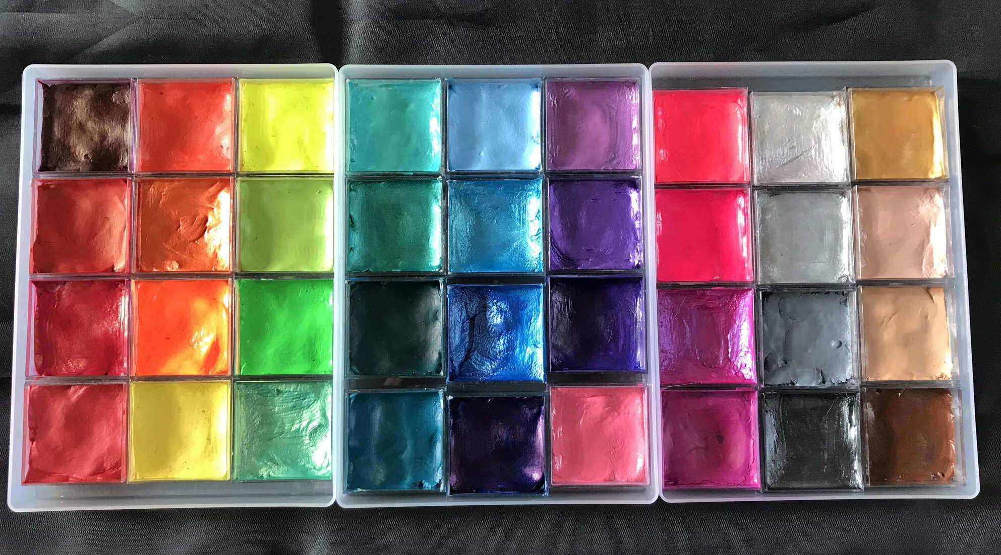
Like my one strokes, I don’t restrict myself to any one brand, as I find that certain brands are better for certain colours or jobs. Superstar shimmers are amazing, so almost all of my metallic paints are by them. Global make beautiful dark colours, which are rich, solid and firm so they are great for line work. Tag, DFX and Cameleon are good all-rounders so there are some of those thrown in for good measure too!
So… repotting. I know that this is a contentious issue and there is a lot of chat about whether it is safe / responsible / hygienic / insurance compliant, but it works for me, and my insurer doesn’t have an issue with how I do it. I like how my set up & breakdown times are much faster because I don’t have 36 individual lids to fiddle with. Each A5 document box holds 12 Amac boxes (perfectly!) and I store them without the individual lids on, so I only have 3 lids to manage. Being square, and smaller in size than the standard round 32g pots, the Amac boxes mean that I can also carry more colours. (The same space fits around 18 x 32g pots!) I think it looks better when set up, and I like the flexibility that it gives me to change things around for different jobs, for example for nightclub jobs I will often just bring one set of 12 paints, with my neons and a few metallic inside, meaning that I can travel light & make a quick getaway when the event ends! I will say that I do my repotting very carefully. My kitchen is scrubbed clean before I start, I wear latex gloves, and I mark the bottom of each Amac box with details of the brand, colour, date of opening & batch number. I also retain the original container so that, in the unlikely event of there being a reaction or anything else that means that I need to trace the paint origins, I can easily do so. I never add new paint to the old so that there is only ever paint from a single batch and pot in each container, and I can always be sure of the expiry date. For everyday use, I tend to keep the paints in the same order because muscle memory is real, and those seconds really do count at busy events!
TRAY 1
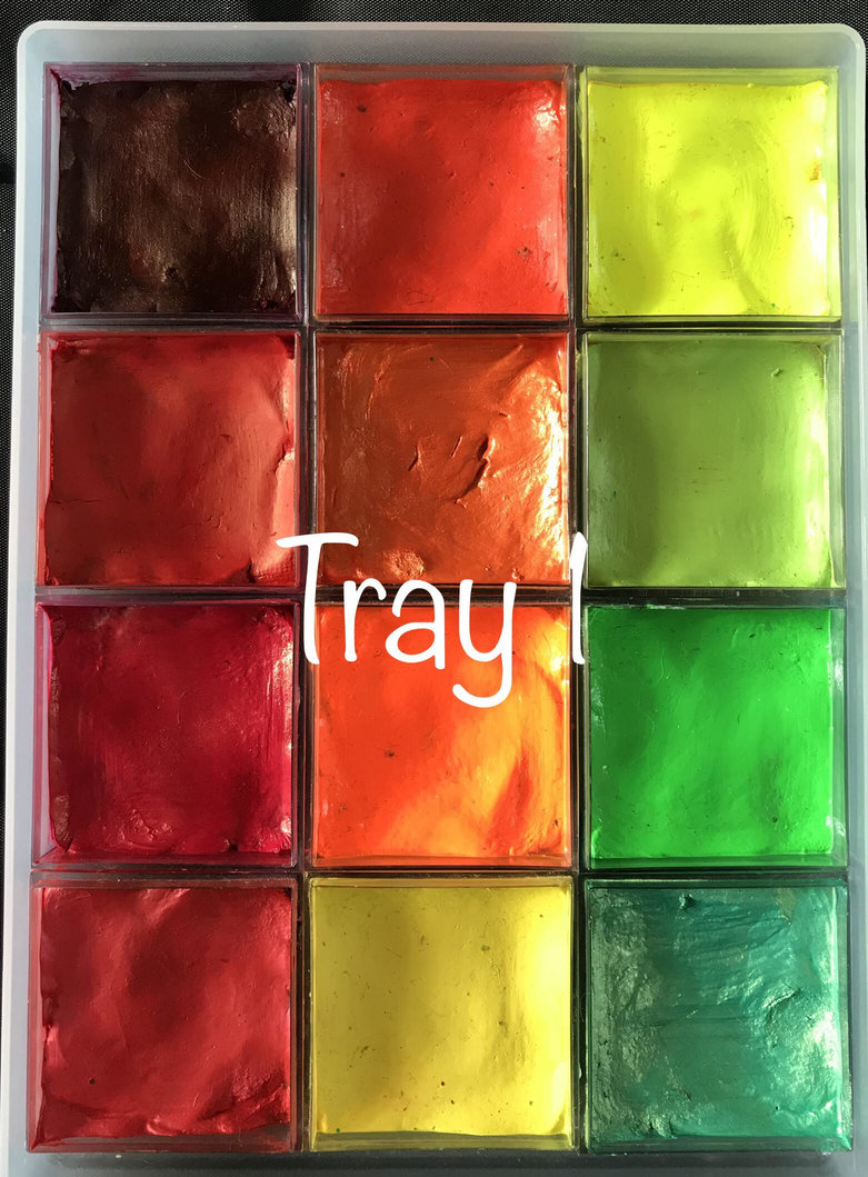
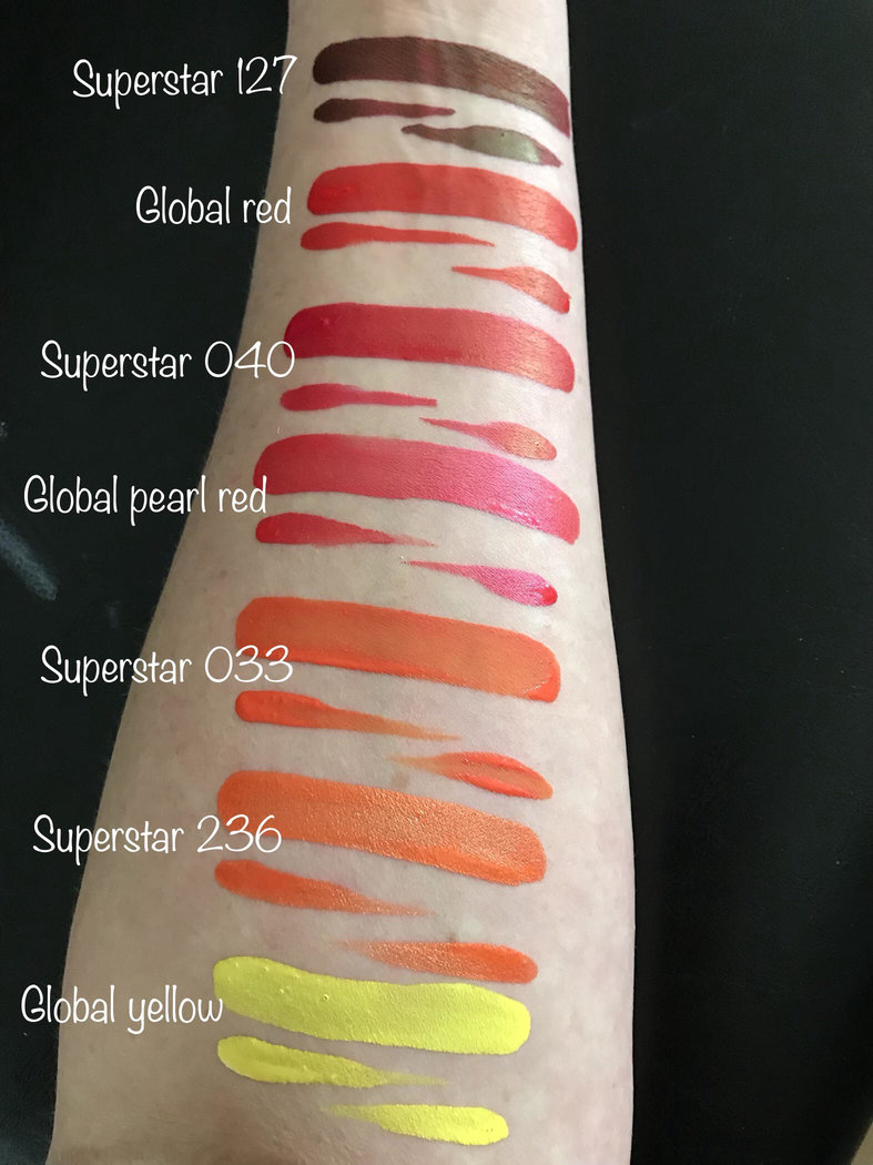
Superstar 127 – Old Red. I LOVE this colour. It is great for outlining butterflies, it makes beautiful double dip flowers, and it is awesome for SFX type work like grazes and dried blood. Any colour that works for princesses and zombies alike is a winner for me!
Global- Red. My go to red almost every time. It is so bright, coverage is amazing and it doesn’t even nearly stain! Great for classic Spiderman faces, reindeer noses and everything in between. It has the typical global firm consistency and is easy to load and use.
Superstar 040 – Pinky Red. This is a fairly recent addition for me and I’m loving it! As the name suggests, it is a pink toned red, and it is perfect for more girlie Spiderman designs, and I’m pretty sure it is the EXACT colour of Ariel’s hair!
Global – Pearl Red. Needs no real introduction other than being that perfect global red, in pearl form!
Second Column, Top to Bottom-
Superstar 033 – Bright Orange. This is the best tiger orange ever. As I find with some Superstar paints, it’s not the crispest paint for line work that ever existed, but it sponge blends like a dream!
Superstar 236 – Ploppy Orange. A close second for amazing tigers. Superstar produce amazing metallic colours and this is no exception. I usually use this for tigers on little kids, along with gold, as it gives a softer result but still shouts RAWWWRRR! This applies perfectly with a brush or sponge so is super versatile.
TAG – Neon Orange. I only carry 5 solid neons and this is always one of them. I find Tag neons to be the best that I’ve tried, and the most consistent in terms of UV and non UV use. I use it for outlining sometimes to make designs pop, and it’s great for adding some depth to designs with larger red or regular orange areas.
Global Yellow. Hands up who finds it hard to find a solid yellow paint with really good coverage? Thankfully, I don’t get asked for too many Minion faces these days, (I’m really not a fan of those little things- whatever they are!) and not much else calls for a solid yellow, so I’ve kind of given up the search. I was using Superstar yellow for sponge work and Cameleon Banana for line work, but decided that I really didn’t need to carry 2 yellows, so have settled on Global regular yellow as a decent compromise for both uses. It’s good, but you will still need 2 coats for any larger areas or on darker skin tones.
Third Column, Top to Bottom-
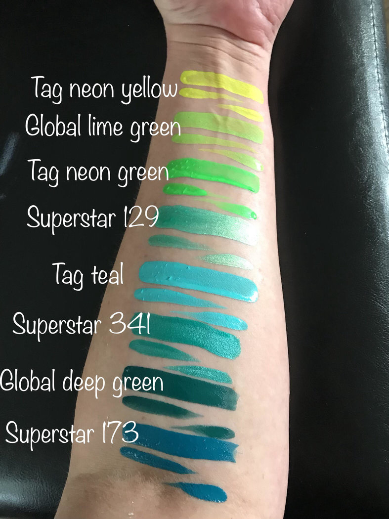
TAG – Neon Yellow. Like most neon yellows, it’s not great without UV light, but boy does it shine in the right conditions!
Global- Lime Green. I use this loads on everything from dinosaurs to foliage and it’s a great colour for brush work and sponging – blending beautifully!
TAG – Neon Green. Like the other neons, I rarely use this for anything other than UV work, but it’s also nice to add some definition on top of other greens for faces like Hulk, Dinos, dragons and Halloween witches!
Superstar 129 – Green Shimmer. I only added this to my kit last month having worked alongside another painter who had it, and it’s gorgeous! It’s a love subtle golden green with that typical Superstar pearlescent shimmer.
TRAY 2
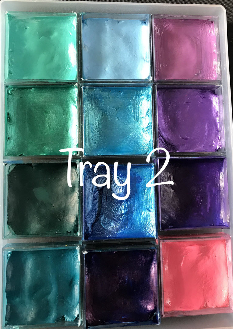
First Column, Top to Bottom-
TAG- Teal. I love this colour. I use it for foliage and outlines, unicorn hair and contrasting spots on butterfly wings. It also gives amazing triple dip petals with white and dark purple!
Superstar 341 – Peacock Shimmer. Another classic shimmer from Superstar, loads like a dream on a brush or sponge, and has a lovely consistency for line work. This colour works great with pearl red and gold for Christmassy designs too!
Global - Deep green. This is my go to green for foliage & swirls on floral designs, and for texture stencilling on monsters, dragons and dinosaurs. Global’s range of dark colours are all stunning and this is no exception.
Superstar 173 – Petrol. I actually won this colour in a TFPS giveaway, and I’m glad that I did as I don’t think I would have tried it otherwise. It is a beautifully rich blue-green, and is amazing for line work, and outlining green designs. I love it!
Second Column, Top to Bottom-
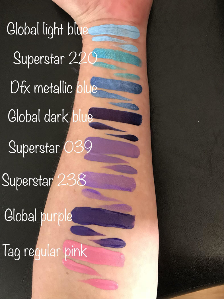
Global- Light blue. Honestly, I rarely seem to use light blue but this is in there just in case!
Superstar 220 - Ziva. Are you even a face painter if you don’t love Ziva? This has to be the ultimate colour. It pops like nothing else, sponges and brushes on amazingly and brings the ‘WOW factor’ to any design I can think of! If you don’t have this, you need it! The only drawback that I’ve found is that it does transfer, so it’s maybe not ideal for larger areas of paint on sweaty children, but other than that it is truly an amazing paint.
DFX - Metallic Blue. This is another amazing colour, and was made for Captain America designs. It has great coverage and loads perfectly. It makes a great highlighter for blue roses too!
Global - Dark Blue. I can’t imagine my kit without Global dark blue in it. It’s a really deep inky blue with an almost metallic sheen. I use this to outline blue and green designs in place of black. It is super pigmented so I don’t use it for large areas of paint (after one particularly traumatic incident with a small child, a bouncy castle, and some white jeans…) but it is still a must have colour in my opinion!
Third Column, Top to Bottom,
Superstar 039 – Mauve. I’m surprised that I don’t reach for this more often as it’s a great colour. As per the name, it is a pinky purple colour, and is great for line work. I only seem to use this regularly for butterfly antennae, but I’ve set myself a little challenge to use it more this week… I shall let you know how that goes!
Superstar 238 – Purple Rain. Another perfect shimmer from Superstar. Purple is my favourite colour, and this is my favourite purple. It’s great for line work and sponging, and is a really rich colour with a great metallic sheen.
Global - Purple. This is a lovely deep purple and it’s great for outlining. I don’t use it a lot for sponging as it is pretty dark, but I wouldn’t be without it in my kit!
TAG – Regular Pink. This is the only solid pink that I carry in my kit, and it’s a good all-rounder. I use it for rosy cheeks, flowers, and everything else that requires a baby pink colour!
TRAY 3
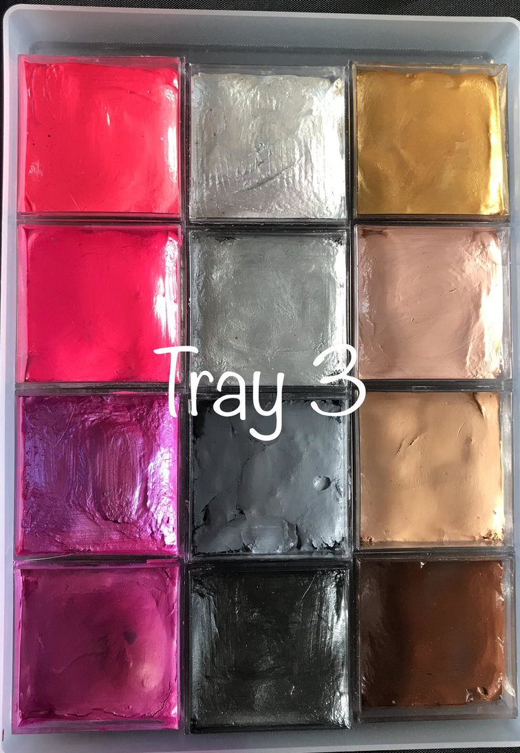
First Column, Top to Bottom-
TAG- Neon Pink. This is one of the Neons that I use for line work as well as UV work. This and Neon magenta (below) are the 2 neons that I use most…usually for unicorn hair and outlining. They can be a little ‘waxy’ so need quite a lot of working before they are ready to use for non UV work, but providing you do that, they both give a nice solid neon pink colour. As the name suggests, the magenta is a little darker and richer than the pink.
TAG Neon Magenta. As above!
Superstar 139 – Pink Shimmer. I LOVE THIS! It is a great colour. Like most Superstar shimmers it is pretty soft and needs little water to work it, but once you get the hang of it, it’s super versatile. It has a gorgeous pinky purpley shimmer and it’s my go to for lip colour also!
Global- Magenta. Another staple, and another fabulous deep rich colour from Global. I go through a lot of this, and use it for every kid of design, but it makes beautiful double / triple dip petals!
Second Column, Top to Bottom-
Superstar 140 – silver shimmer. Finding a white / silver shimmer that works for lines and bases is tricky. They seem to be great at one or the other but not both – but this is the best that I’ve tried. It’s super sparkly and blends like a dream, and is great for all those upcoming Halloween sugar skulls!
DFX Silver. Silver isn’t a colour that I use a lot, but this is in there just incase I happen to need one! Does what it says on the tin, and is a deeper grey-silver than the superstar above.
Cameleon – Fifty. I don’t use a lot of grey, and I’m honestly not use that I’ve tried any others, but Fifty is a great shade, and, like most Cameleon paints, is great for both blending and line work.
Superstar 233 – Graphite. WHAT A COLOUR! This is a recent addition for me and I’ve been using it a lot in place of black for a softer look. I’m planning to use it a lot at Halloween as it is a great, super shimmery true graphite colour and much more rich and eye catching than regular black. It’s a typical superstar soft metallic and is a really stunning addition to any kit!
Third Column, Top to Bottom-
Cameleon- Oscar. I’ve tried lots of golds but this is my favourite. It’s a rich, bright yellow gold which shimmers but doesn’t sparkle, making it ideal for iron man! It applies really smoothly and, provided you take your time loading it, doesn’t need a second coat like most golds seem to!
Superstar 015 – Skin. Again, I don’t use this a lot but keep it incase I need it! (Does this make me a paint hoarder?) It is a great medium skin tone colour with a pink undertone.
Tag - Regular Bisque. This is the middle colour from the Tag Teddy Bear one stroke, and is great for animals and darker skin tones. Like the Superstar above, I don’t need it a lot but I keep (hoard?) it just incase!
Superstar 024 – Chocolate Brown. My go to brown! Rich, creamy and easy to blend, it is great for outlining designs using the Tag Teddy Bear one stroke, and for animal designs in general!
.jpg)
This brings me to the end of my ‘Introducing my kit’ series of blog posts. I hope that they have been helpful - make sure you bookmark them for future reference!
Next week I will be demoing a fast zombie design which is great for busy Halloween events and doesn’t require any SFX materials so fab for beginners and pro’s alike!
Kathryn!

No comments:
Post a Comment